Design System
MICROIP IT Department's Design Language & Color Palette
Design Philosophy
"A calming, editorial experience for deep reading."
The design language of the MICROIP IT Knowledge Base draws inspiration from traditional print and editorial design. We deliberately moved away from high-contrast, stark white backgrounds that cause visual fatigue. Instead, we embraced a warm Warm Parchment (#F0EEE6) as the foundation, layered with Warm Surface to create depth, providing engineers with the most comfortable reading experience for long technical documents.
Interactions are intentionally restrained — hover effects use only subtle border/shadow changes without 3D tilt, glow, or movement. For typography, we opted for a warm Near-Black (#141413) in combination with Cloud Dark for metadata, balancing legibility with reduced visual strain. Our card system utilizes desaturated, nature-inspired tones (Sage Green, Manilla), injecting organic warmth into a professional IT environment.
Light Mode — Core Palette
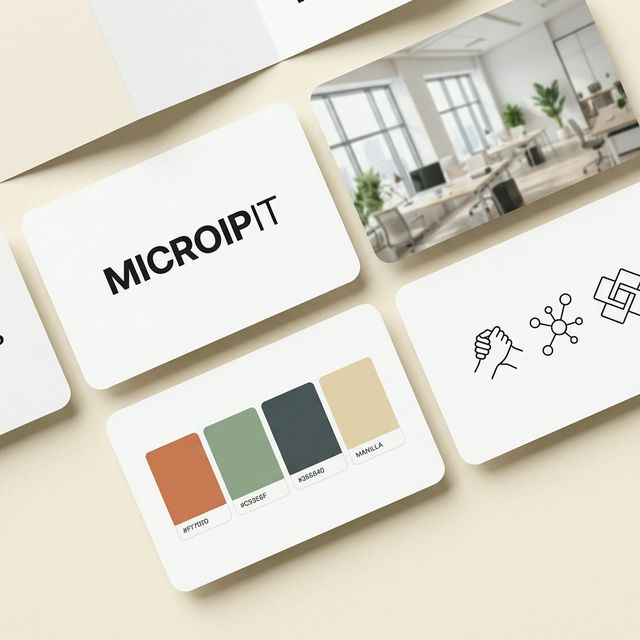
Warm Parchment
#F0EEE6
Background
Warm Cream
#E8E5DB
Alt Background
Warm Surface
#F7F5EF
Surface / Card
Near-Black
#141413
Primary Text
Cloud Dark
#666663
Muted Text
Warm Border
#D5D2C9
Border / Divider
Accent & Card Colors
Book Cloth
#CC785C
Primary Accent
Kraft
#D4A27F
Hover Accent
Manilla
#EBDBBC
Card Color 1
Cloud Light
#BFBFBA
Card Color 2
Sage Green
#B2C2B9
Card Color 3
Ivory Dark
#E5E4DF
Card Color 4
Dark Mode — Core Palette
Slate Dark
#141413
Background
Slate Medium
#1F1F1E
Surface / Card
Ivory Light
#FAFAF7
Primary Text
Cloud Medium
#91918D
Muted Text
Slate Light
#333331
Border / Divider
Dark Mode — Card Colors
Dark Manilla
#3D3425
Card Color 1
Dark Cloud
#33332F
Card Color 2
Dark Sage
#2D3B35
Card Color 3
Dark Ivory
#2E2E2B
Card Color 4
Dark Book Cloth
#3A2A24
Card Color 5
Immersive Dark — Admin-only Extension
Deeper, warmer background palette with glass surfaces. Used exclusively by the admin CMS and login page. Removed from the public site in v1.5.44 (no more particle mesh).
Deep Warm Black
#141311
Admin Background
Warm Charcoal
#1a1815
Sidebar / Alt Background
Dark Surface
#1e1c19
Modal / Drawer Solid
Elevated Surface
#2a2724
Hover / Active Surface
Immersive Dark — Glass Surfaces
Glass Surface
rgba(255,255,255,0.04)
Cards / tables / panels
Glass Hover
rgba(255,255,255,0.06)
Hover / active state
Accent Glass
rgba(204,120,92,0.12)
Active nav / selected
Badges — Semantic Colors (admin / status-only)
These 6 semantic colors are scoped to admin status / category badges only (section color / difficulty / delete action). The public site still follows the "One accent — Book Cloth #CC785C" discipline — body, headings, links never use these.
Typography
MICROIP IT
Noto Sans TC / Inter — Headlines & UI (700, tracking-tighter)
The quick brown fox jumps over the lazy dog
Newsreader — Body & Editorial (400 italic, serif)
const x = 42;
JetBrains Mono — Code & Labels (400, monospace)
// MICROIP IT — Design Tokens
export const colors = {
  accent:   '#CC785C',  // Book Cloth
  bg:      '#FBFAF5',  // Soft Alabaster
  surface: '#FFFDF8',  // Ivory
};
Components
Buttons
Active: scale(0.98) tactile feedback
Badges & Tags
Callout Boxes
Info
Use this callout for helpful tips and notes.
Warning
Use this for important warnings that require attention.
Related Article Card
Bolder Scale — Current Sizes in Use
clamp(3.5, 9vw, 6.5)rem clamp(2, 5vw, 3.4)rem clamp(1.75, 3.2vw, 2.5)rem 1.02rem / 1.7 0.72rem mono Blockquote — v1.5.80 (no stripe, opening-quote cue)
Great editorial design disappears — you read without noticing the type.